Repositioning a river-guide-founded whitewater outfitter from a budget rental shack into a premium, expert-led adventure brand for bucket-list travelers, gear-minded outdoor enthusiasts, and corporate retreats.
Redtail Outfitters started as a two-raft guiding operation run by river guides who knew the water better than anyone. Over fifteen years it grew into a full outfitter — whitewater rafting, rock climbing, zip-lining, guided backcountry hikes — and launched its own line of branded trail gear. The identity never grew up with it.
The original mark was a clip-art raft icon slapped together in year one. Brochures, gear tags, and the website all looked different from each other, and none of it looked like a safety-certified outfitter with career guides. It read as a budget rental shack — and it was routinely passed over by higher-spending travelers researching a real bucket-list trip, and by companies vetting a vendor for a corporate retreat.
Redtail Outfitters guides whitewater rafting, rock climbing, zip-lining, and backcountry hikes across the Appalachian region, alongside its own line of trail-ready gear. The strategy was to position the brand as the premium, expert-led choice for travelers who want a real wilderness experience with total confidence in their guides — without sanding off the scrappy, in-the-water authenticity that makes river guides trustworthy in the first place.
Ages 28–55, planning a multi-day adventure trip, want a safe, expertly guided experience worth the splurge.
Regular hikers and paddlers who want durable, trail-tested branded gear they'll actually use season after season.
Companies booking team trips who need a professional operator they can put on a company itinerary.
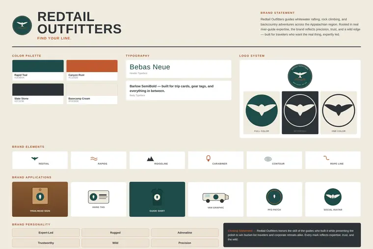
The final system pairs a Redtail Rapids Badge as the primary mark — an expedition-patch stamp built around a red-tailed hawk in flight over a rapids line — with a simplified hawk-in-flight icon as a versatile secondary mark for hang tags, patches, and social profiles.
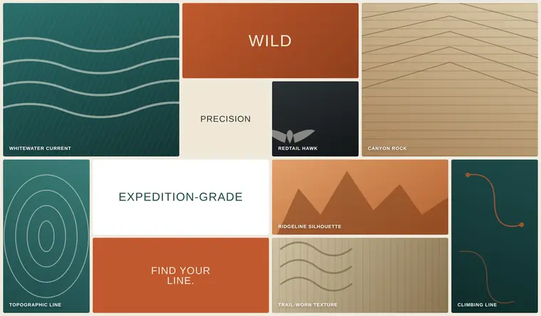
Research started at the put-in and the trailhead, not at a desk — whitewater current lines, canyon rock strata, ridgeline silhouettes, and the red-tailed hawks that circle over both the river and the ridge became the visual language for the mark.
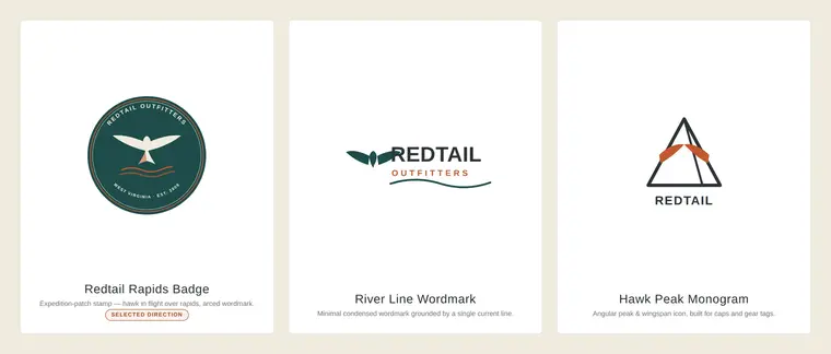
The River Line Wordmark tested well on caps and hang tags but couldn't carry the "safety-certified outfitter" weight the brand needed on signage and vehicles. The Hawk Peak Monogram was distinctive but read closer to a climbing gym than a full-service outfitter. The Redtail Rapids Badge won out for the same reason a good expedition patch always does: it reads as earned, not decorated — and it scales from a hang tag to a trailhead sign without losing any of its detail.
The real test of a field-ready identity isn't a brand board — it's whether it holds up on a gravel put-in at 8am, soaked in river water, loaded onto a fleet vehicle, and read at a glance by a guest who's never been on the water before. The Redtail system was built for exactly that.

The badge mark shows up consistently across guide shirts, helmets, and the raft itself, while the river-conditions signage carries the same teal-and-rust system guests see on the website and in the parking lot — so the brand reads as one operator, not a patchwork of vendors.

Every piece guests and guides actually touch — PFDs, helmets, dry bags, the first aid and river safety kits, even the paddles — carries the hawk mark and the same two-color system, so the gear reads as premium rental equipment, not a rental-shack afterthought.

The identity extends to the fleet and the outpost itself — the same badge, wordmark, and current-line graphic system carried from a hang tag all the way up to a full vehicle wrap, so the brand is recognizable whether a guest sees it online, at the takeout, or driving past on the highway.
Primary badge, secondary hawk icon, and clear-space & color rules.
Color palette, typography system, and usage rules.
Consistent look for guided trip listings and the retail gear line.
Outpost signage, put-in/take-out banners, safety signage.
PFD patches, guide shirts, hang tags for the retail line.
Homepage and trip-booking experience built around the new system.
The resulting identity positions Redtail Outfitters as a premium, expert-led adventure brand for the Appalachian region — keeping the hands-on river-guide authenticity that built its reputation, now presented with the polish to win bucket-list travelers, corporate retreats, and gear customers who want to represent a brand built for the wild, not a rental counter.
Ironwood Creative Studio builds full identity systems from strategy through final delivery.
Start a Project