Repositioning a family-owned timber company from commodity lumber supplier to premium partner for architects, luxury homeowners, and custom builders.
Appalachian Timber Co. had built a strong reputation through quality craftsmanship, sustainable forestry practices, and dependable service. But its visual identity hadn't been touched in over two decades, and it no longer reflected the caliber of the products or the clients the company wanted to attract.
An outdated logo with poor legibility, inconsistent marketing materials, and a generic visual identity meant the brand read as commodity lumber rather than premium craftsmanship — and it was routinely overlooked by the architects, interior designers, and luxury home builders it needed to win over.
Appalachian Timber Co. provides sustainably sourced premium hardwoods and custom wood products for homeowners, designers, and builders who value authenticity, craftsmanship, and enduring quality. The strategy was to elevate that story visually — grounding a premium brand in Appalachian heritage, hands-on craftsmanship, and sustainability, without losing the honesty that made the company trustworthy in the first place.
Ages 35–65, building or renovating high-value properties, interested in natural materials and authentic craftsmanship.
Specify premium materials, need dependable suppliers, and want partners who understand aesthetics.
Need consistent quality and reliability from professional suppliers who respect project timelines.
The final system pairs a Heritage Timber Stamp as the primary mark — inspired by vintage mill marks and timber inspection stamps — with an ATC Timber Frame Monogram as a versatile secondary icon, built from the same joinery lines used in real timber-frame construction.
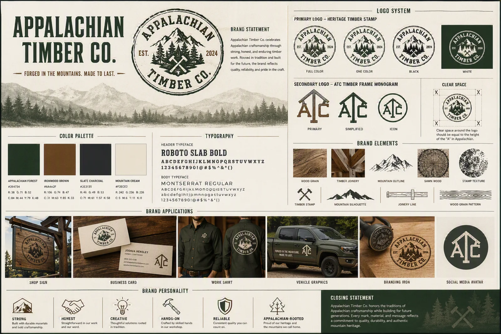
Every mark in the final identity traces back to pencil sketches — three directions were explored, refined across two rounds, then narrowed to a final logo system.
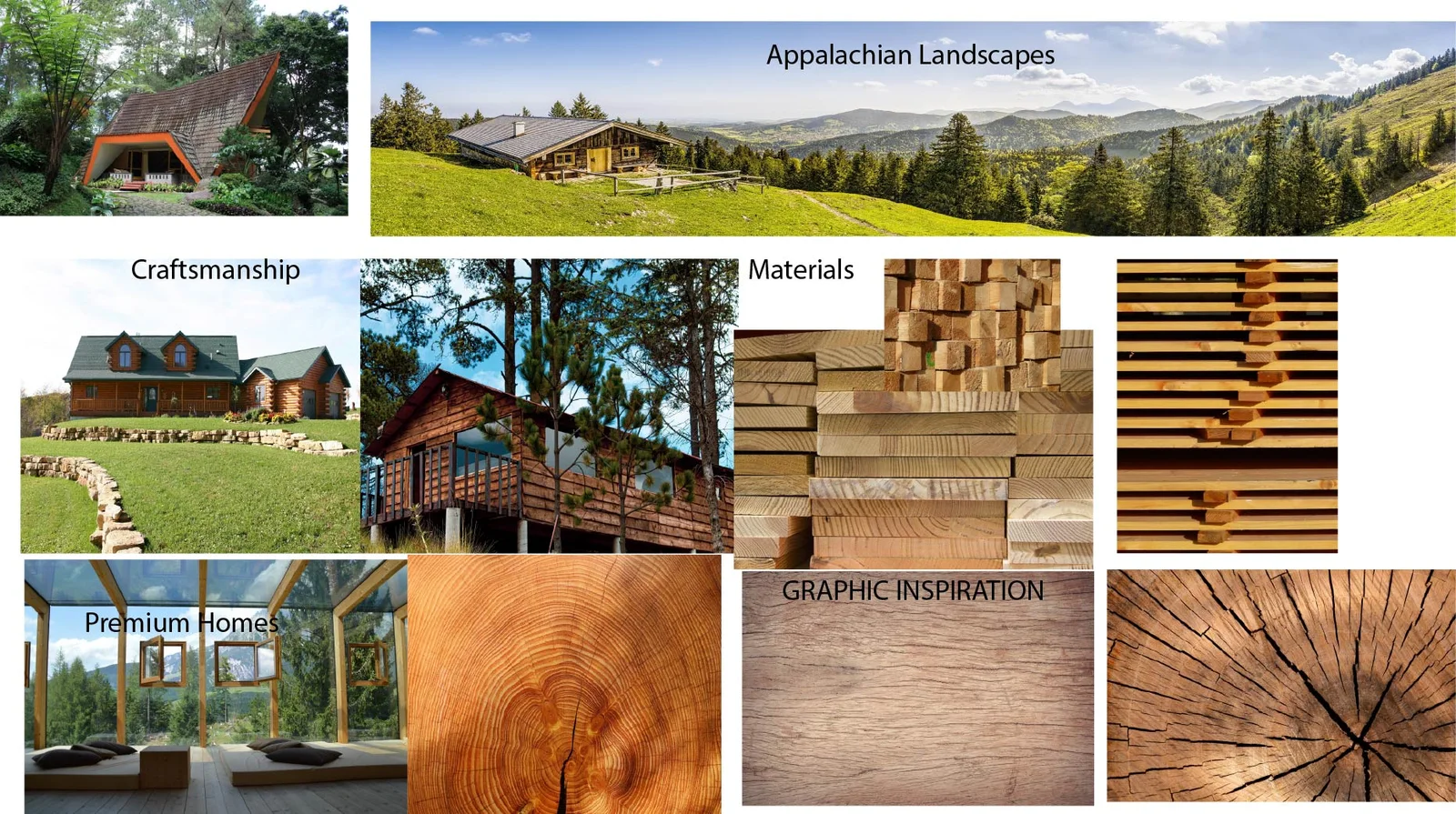
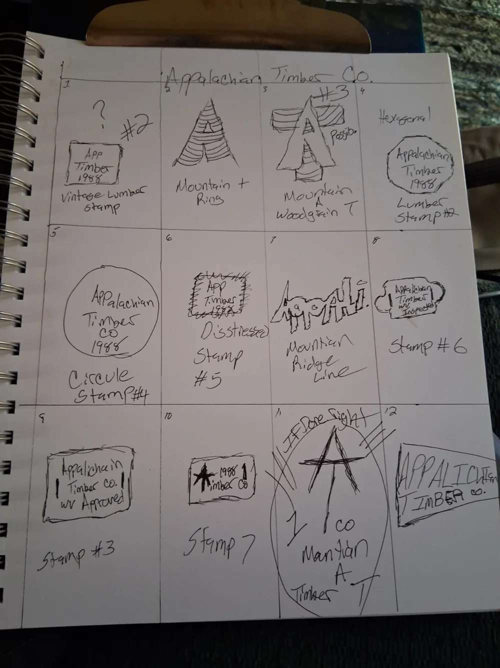
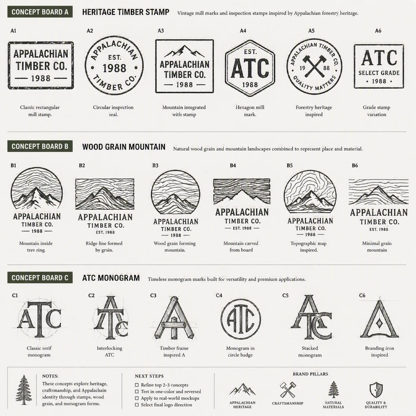
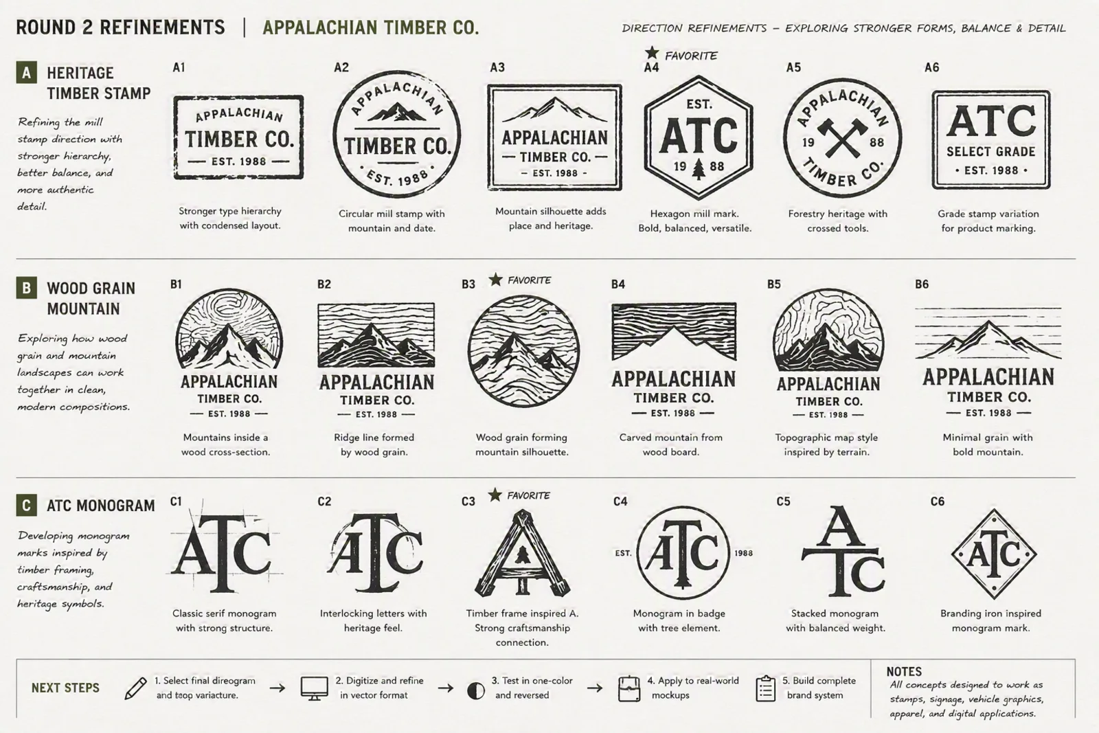
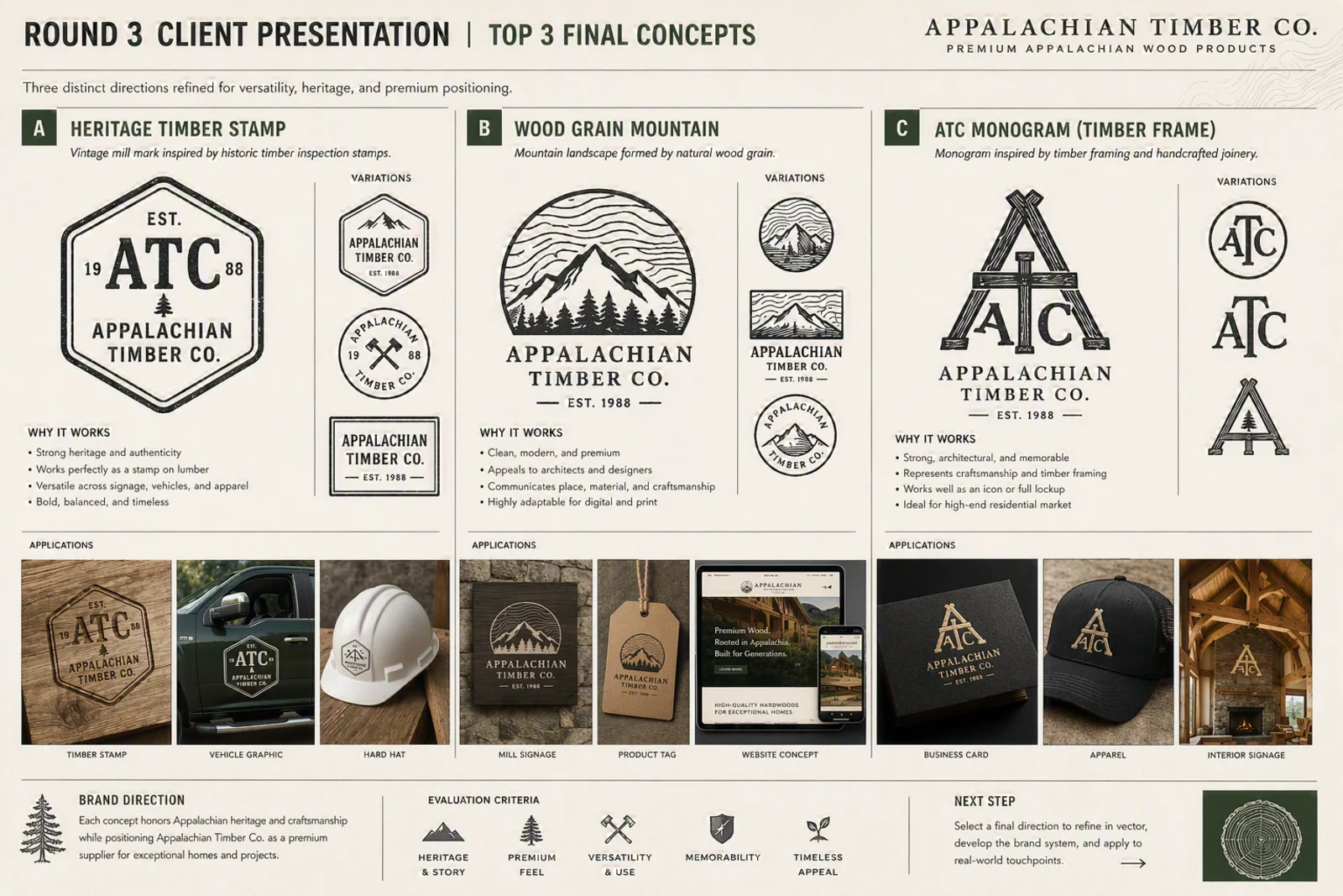
The Heritage Timber Stamp was selected as the primary mark for its authenticity and versatility across signage, vehicles, and apparel, with the ATC Timber Frame Monogram carried forward as a secondary icon for tighter spaces.
Primary mark, secondary monogram, icon, and clear-space & color rules.
Color palette, typography system, and usage rules.
Business cards, letterhead, email signature, social profiles.
Timber stamps, mill signage, hard hat branding, product tags.
Work-truck door graphics carrying the mark into the field.
Website homepage and mobile concept built around the new system.
The resulting identity positions Appalachian Timber Co. as a premium wood products partner for exceptional residential projects — grounded in the same Appalachian heritage and craftsmanship the company was already known for, now presented with the polish to win the architects, designers, and luxury builders it was built for.
Ironwood Creative Studio builds full identity systems from strategy through final delivery.
Start a Project